Emily Dirsh
Leading UX Strategy Together: Crafting Clarity out of Complexity with Collaborative Problem-Solving
emily.dirsh@gmail.com
|
978-666-4494
|
https://linkedin.com/in/emilydirsh

Executive Summary Report
A report presentation meant to give a high level overview of the company's cybersecurity performance alongside key metrics.
Vision
Why did we do this?
Strategic Objective
We had a business objectives for increasing the satisfaction of Leadership-level users, as they are in a position to make buying decisions and were underrepresented amongst the user base.
We had discovery insights indicating that reporting was one of the larger points of dissatisfaction amongst that cohort. Additionally we had a manual process for generating high level reports that was expensive and time-consuming.
Tackling this report had high feasibility and high potential for increasing user satisfaction.
Problem
High-level cybersecurity managers need to report on their performance to executives and board members. This requires conveying complicated, technical information to a non-technical audience while being understandable, accurate, and concise.
Target User
High level cybersecurity managers, such as Directors or CISOs, presenting information to a non-technical audience.
Desired Outcome
A brief summary presentation that can be configured and downloaded by a user. The report must include enough information to provide a comprehensive picture of the company's cybersecurity performance over a specified period of time, the relevant context, and points of interest.
Outcomes
What did we do?
Solutions
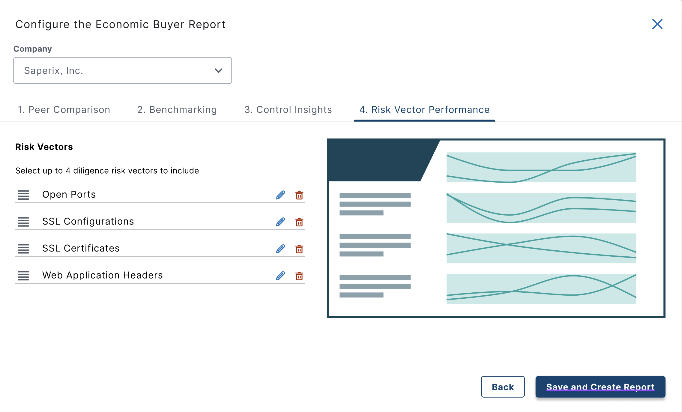
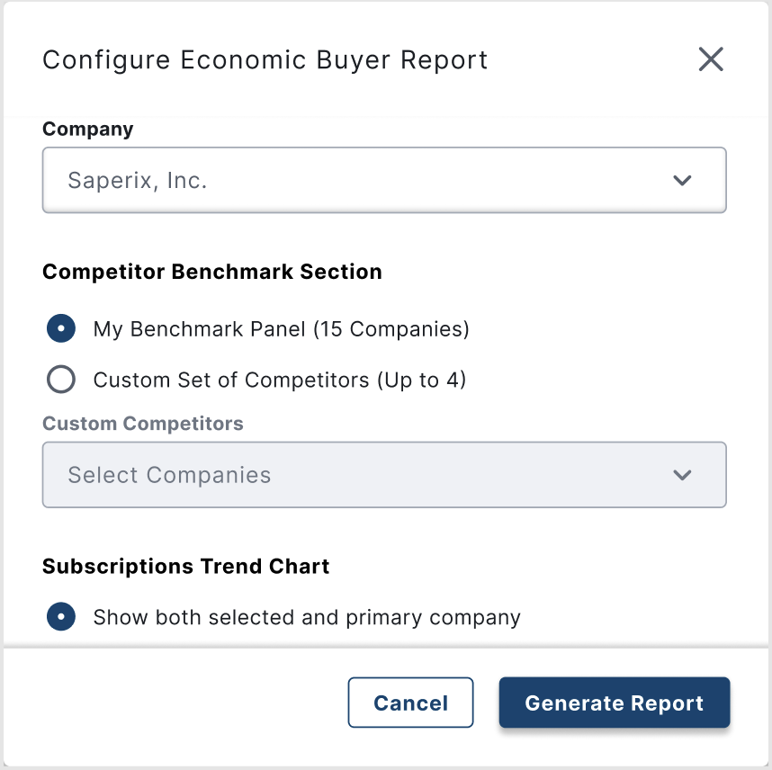
As cybersecurity postures vary widely, we settled on a high degree of configurability to allow our users to tailor the report to their own situation and audience. This was offered within reasonable constraints, so that users are not having to author their own report, rather define axes within an existing framework.
We built the report to output a standard slideshow format, which could be easily edited post-download by the user. This allows users to add their own content to our slides, and add or remove slides if needed.
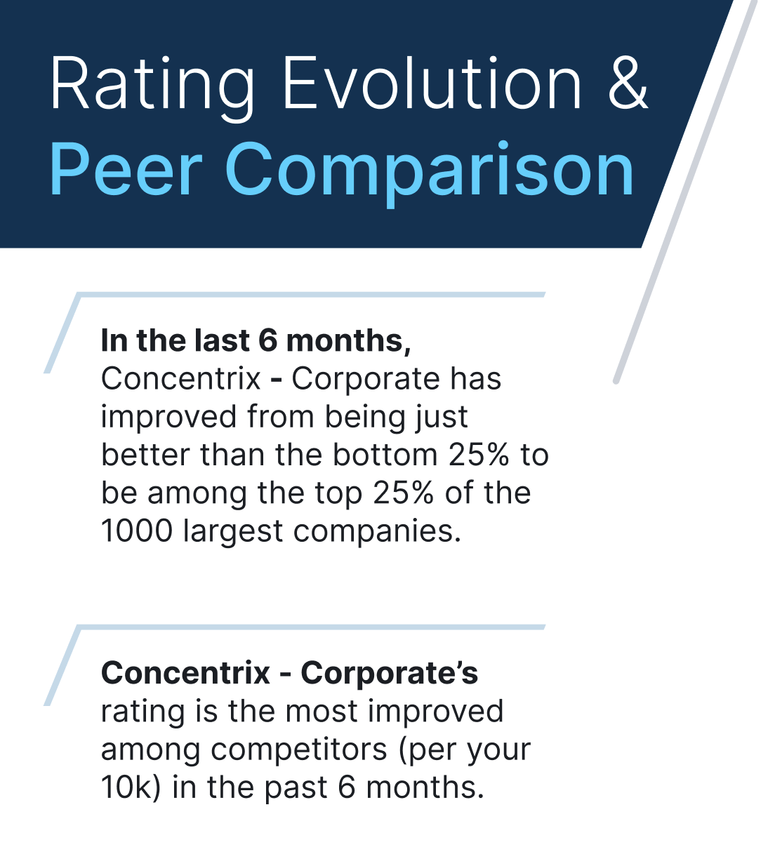
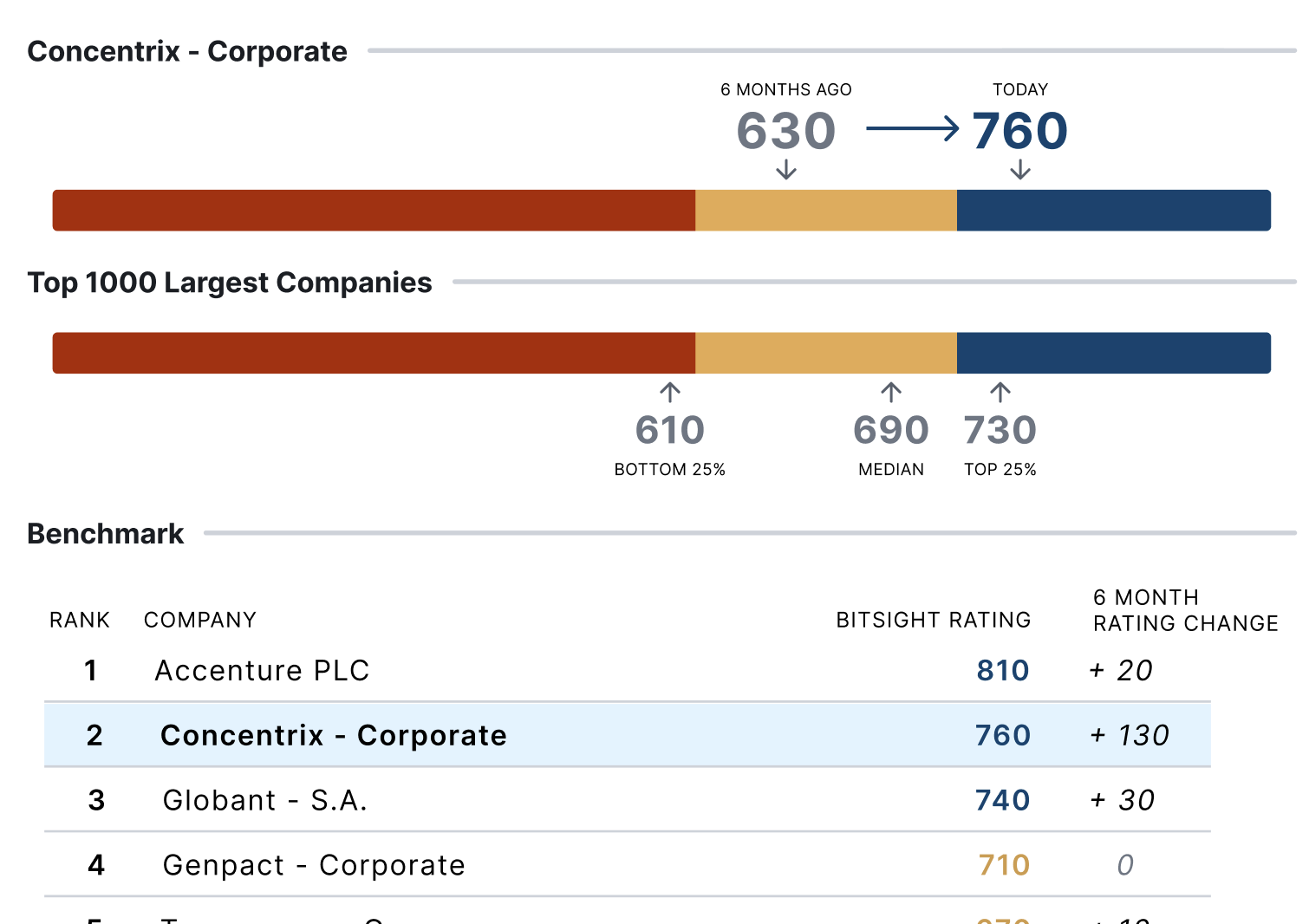
We kept our content visual, so that it could be seen and understood from a distance in a conference room.
We included a number of points of comparison, allowing even non-technical users to contextualize performance numbers appropriately.
Users could include their own commentary
Comparison data added where appropriate
Configurability within thoughtful constraints
User Outcomes
Post launch user feedback was overwhelmingly positive, and adoption was within expectations for the user and use-case. Previously, this style of report had often been created by hand by our in-house customer success personnel.
- More than 60% of identified CISO- and Director-level users had downloaded this report at least once
- More than 70% of those who had downloaded this report once, downloaded it again
- About 40% of users who adopted this report set up a regularly scheduled version of the report
- Estimated to have saved 100 hours per week of Customer Success time
Implementation
How did we do this?
Process

Existing Customer Success Work
Review existing templates, interview internal customer success members
User Interviews
Interview CISO- and Director-level users for reporting needs
Concept Creation
Create multiple concept slides
Concept Refinement
Review and refine slides with internal customer-facing teams
Concept Testing
Test slides with CISO- and Director-level users; discard unneeded concepts, identify areas for improvement and customization
Concept Finalization
Refine slide designs based on user input; develop configuration UI designs
Implementation
Support engineering through implementation; monitor for a11y and design system compliance; assist with analytics set up
Launch
Assist with internal training materials and customer instruction content
Measure Outcome
Analyze user feedback and usage analytics
Post-Launch Updates
Design and implement updates to slides based on initial user feedback and analytics
Wrong Turns
What didn't work?
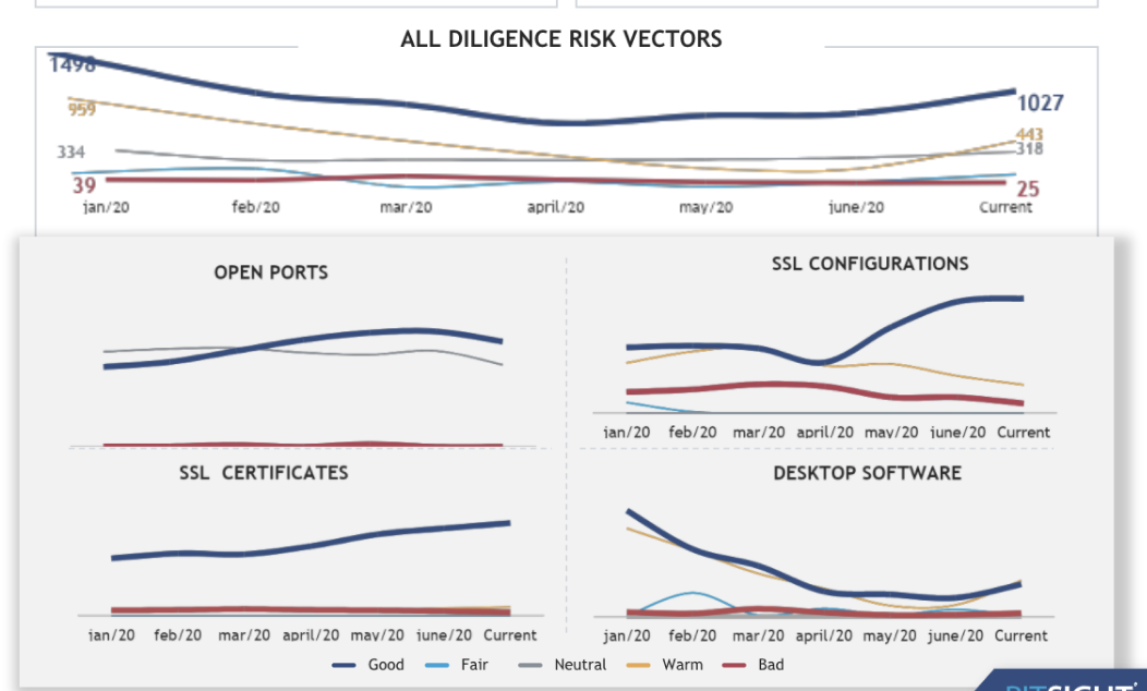
Detailed charts were too hard to read at a distance
Simpler customization options weren't adequate for user needs
Teams
- Customer Success
- Sales
- Project Management
- UXD
- Engineering
Emily Dirsh
Leading UX Strategy Together: Crafting Clarity out of Complexity with Collaborative Problem-Solving
emily.dirsh@gmail.com
|
978-666-4494
|
https://linkedin.com/in/emilydirsh
Executive Summary Report
A report presentation meant to give a high level overview of the company's cybersecurity performance alongside key metrics.
Vision
Why did we do this?
Strategic Objective
We had a business objectives for increasing the satisfaction of Leadership-level users, as they are in a position to make buying decisions and were underrepresented amongst the user base.
We had discovery insights indicating that reporting was one of the larger points of dissatisfaction amongst that cohort. Additionally we had a manual process for generating high level reports that was expensive and time-consuming.
Tackling this report had high feasibility and high potential for increasing user satisfaction.
Problem
High-level cybersecurity managers need to report on their performance to executives and board members. This requires conveying complicated, technical information to a non-technical audience while being understandable, accurate, and concise.
Target User
High level cybersecurity managers, such as Directors or CISOs, presenting information to a non-technical audience.
Desired Outcome
A brief summary presentation that can be configured and downloaded by a user. The report must include enough information to provide a comprehensive picture of the company's cybersecurity performance over a specified period of time, the relevant context, and points of interest.
Outcomes
What did we do?
Solutions
As cybersecurity postures vary widely, we settled on a high degree of configurability to allow our users to tailor the report to their own situation and audience. This was offered within reasonable constraints, so that users are not having to author their own report, rather define axes within an existing framework.
We built the report to output a standard slideshow format, which could be easily edited post-download by the user. This allows users to add their own content to our slides, and add or remove slides if needed.
We kept our content visual, so that it could be seen and understood from a distance in a conference room.
We included a number of points of comparison, allowing even non-technical users to contextualize performance numbers appropriately.
Users could include their own commentary
Comparison data added where appropriate
Configurability within thoughtful constraints
User Outcomes
Post launch user feedback was overwhelmingly positive, and adoption was within expectations for the user and use-case. Previously, this style of report had often been created by hand by our in-house customer success personnel.
- More than 60% of identified CISO- and Director-level users had downloaded this report at least once
- More than 70% of those who had downloaded this report once, downloaded it again
- About 40% of users who adopted this report set up a regularly scheduled version of the report
- Estimated to have saved 100 hours per week of Customer Success time
Implementation
How did we do this?
Process
Existing Customer Success Work
Review existing templates, interview internal customer success members
User Interviews
Interview CISO- and Director-level users for reporting needs
Concept Creation
Create multiple concept slides
Concept Refinement
Review and refine slides with internal customer-facing teams
Concept Testing
Test slides with CISO- and Director-level users; discard unneeded concepts, identify areas for improvement and customization
Concept Finalization
Refine slide designs based on user input; develop configuration UI designs
Implementation
Support engineering through implementation; monitor for a11y and design system compliance; assist with analytics set up
Launch
Assist with internal training materials and customer instruction content
Measure Outcome
Analyze user feedback and usage analytics
Post-Launch Updates
Design and implement updates to slides based on initial user feedback and analytics
Wrong Turns
What didn't work?
Detailed charts were too hard to read at a distance
Simpler customization options weren't adequate for user needs
Teams
- Customer Success
- Sales
- Project Management
- UXD
- Engineering